

Client
Charitable Impact
Services
Illustration
Art Direction
Industry
Financial Services
Build a brighter future.
Charitable Impact is a public foundation that operates as a donor-advised fund. In short, this means they help people manage their charitable giving from a single account. Their app helps users manage and plan their charitable endeavours, find and give to their favourite charities all from one place. Through their app folks can also connect to a wider giving community, making it easier to give with friends, family, and others who care about the same things.
The team kindly asked me to help them develop their illustration style. Some of their needs were a moderate to large character exploration and depicting the concept of giving as a joyous and enjoyable experience rather that relying on the more classic route that inspires guilt.

Project Insights
The team really liked a series of empty state illustrations I made in the past to illustrate some clear examples on how you could add a little excitement to those often overlooked parts of a product. And since that’s one of the arias where they needed the help we used some of those as a reference on direction moving forward.
They also pointed out that they wanted them to be vibrant and happy to really compliment the voice and tone of their brand.
Our goal was to make them playful, light and fun with a strong push on playful.

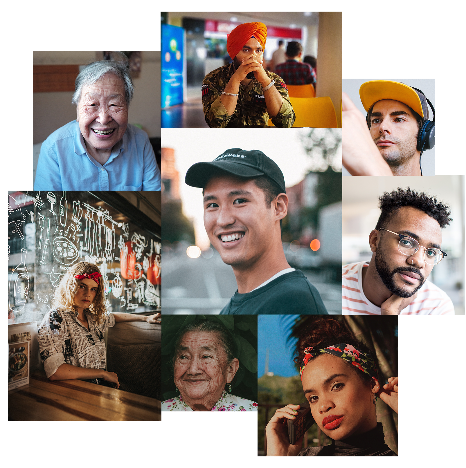
As I mentioned before we wanted to do our best to include racial and cultural diversity. I explored a range of physical features — hairstyle, clothing, facial features etc. We wanted everyone who works for Charitable Impact and who uses the platform to feel represented.
I use Unsplash photos here as an example but initially the team provided a very big data base of images of real people to reference from.
Sketching and
Here you can see a few examples of my first crack at a style exploration. Initially we didn’t know how expressive we wanted the characters to be since the color palate was already very bright and I worried that I was overdoing it.
After discussing it with the client and reviewing their feedback we settled on positioning characters in the forefront. Meaning that the illustrations would now have to have concepts around and including characters. While also adding facial features and recognisable hairstyles etc. to really drive the idea of inclusion home. This is where the for mentioned data base of people came in to play.
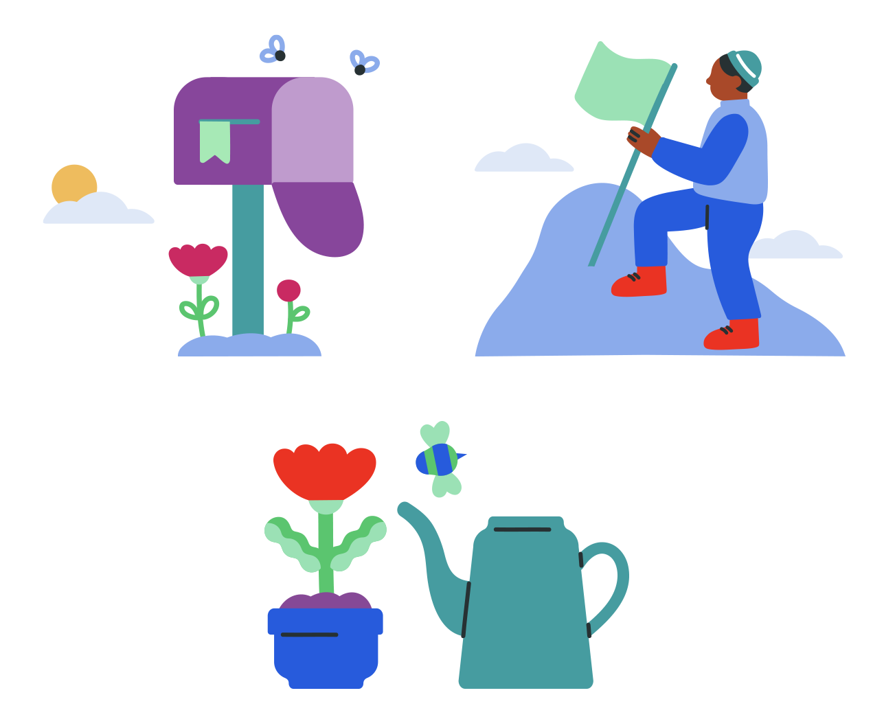
Illustrations first iterations samples
Last stretch
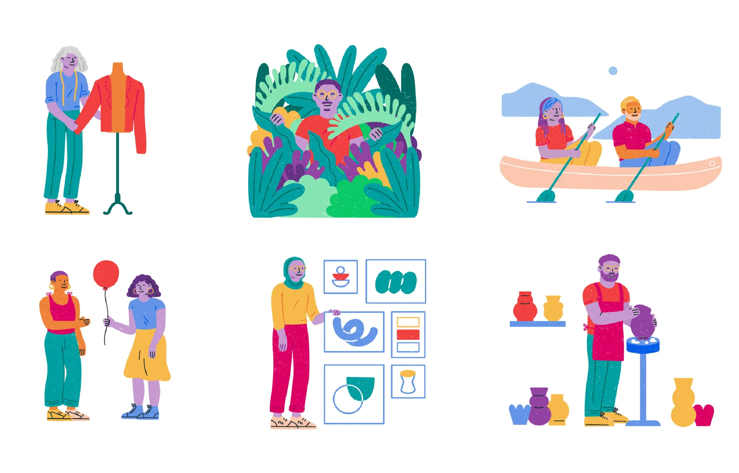
In the end we ended up combining and working with the color palate that we borrowed from the logo. This was a very important for the client so we made it work—and I think it turned out great if I do say so myself.
We also added a light touch of texture that you might have picked up on. Even tho these were vector illustrations we wanted them to feel a little more organic.

Final looks!


Spot illustrations from Illustration library

Badge illustrations examples from Illustration library