

Client
Loomis LTD
Services
Illustration & Iconography
Art Direction
Industry
Tech & Retail
A complete payment solution for cash, cards and other digital payments.
Loomis Pay offers a complete end-to-end payment solution that
helps merchants, restaurants and shops run and grow their business.
The payment solution is the first comprehensive service that allow merchants to handle cash, cards and mobile payments through one single provider.
My role on this project was to come up with an illustration style that fit their ever evolving brand expression. The main idea behind these illustrations was to encourage a playful tone while still maintaining their practicality.
Project Insights
I always like it, nay prefer, when clients pick out illustrations from my instagram and/or portfolio in general and point to specific things that stood out to them. Things that they feel would fit well with their goal for the project, and their brand voice. This time was no different they pointed out that they liked not only the style but the overall tone, mood. With that in mind we had a clear starting point.

Since they needed to be able to change the colors in Figma at will and scale them easily, they had to be drawn in Illustrator (vector). And since they liked the organic feeling of the previous illustrations (see above) one challenge was to ‘fake’ a hand drawn look . In the example you can see that we went from straight or ‘clean’ stroke-lines to more organic looking ones. I was quite chuffed that this was possible and I think so was the team.

Sketching and planning faze

With the references in hand, I started sketching away our concepts for a few of the scenarios that needed some visual aid, or maybe just a little help to outline a message that’s perhaps a little harder to convey only in words.
I like to have the copy close at hand, copy is very important because without it it’s complicated to come up with a clear concept if not impossible!
Sketches sample

Sketches and use-case example
If the layout is ready (which is ideal)—I’m more than happy to draw the sketch right were it will end up. This helps me and the client get a better sense of how things will look when it’s all said and done.
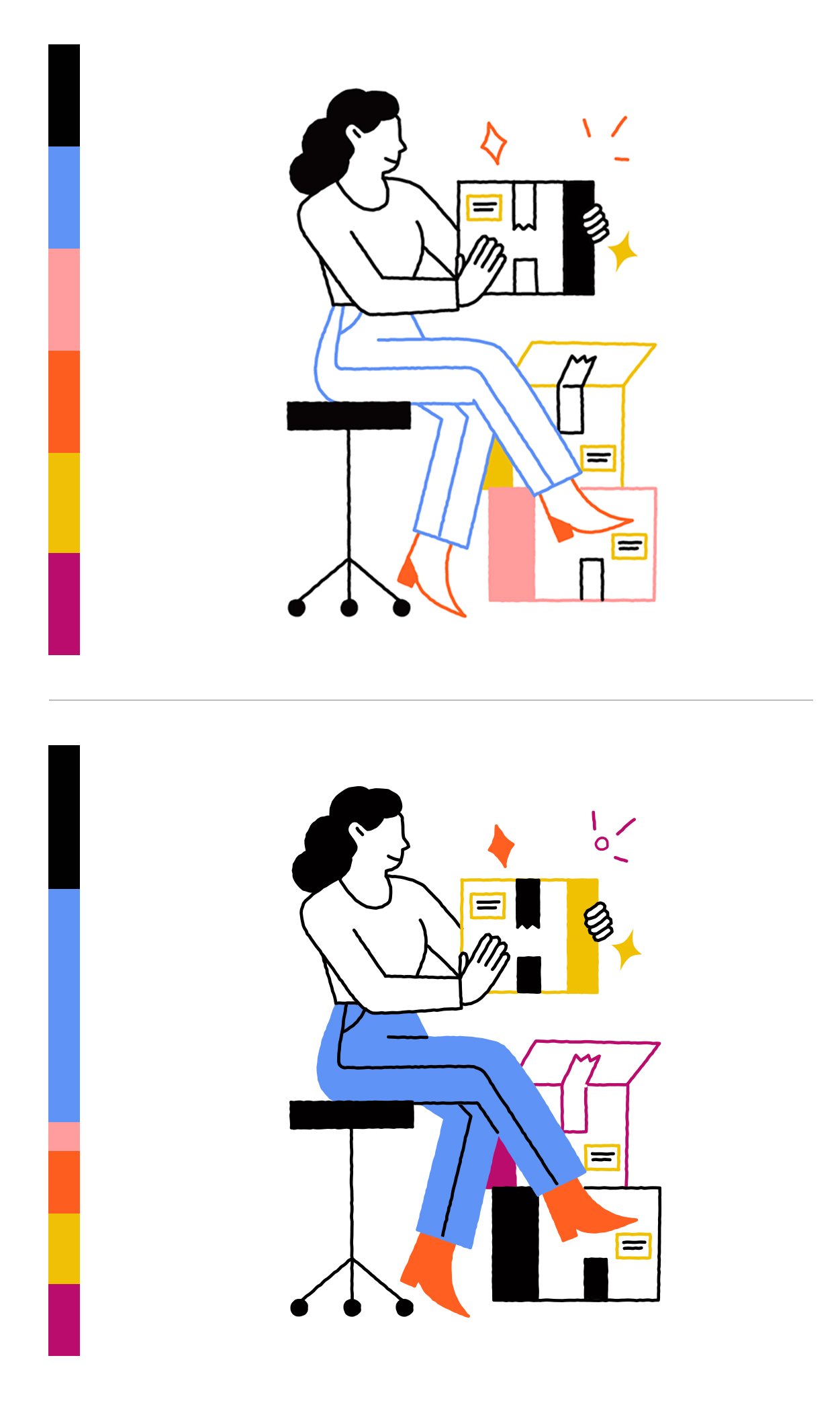
Color distribution
The color palette was meant to be switched up at will, that’s what the project called for and I had no problem to deliver on those wishes. That being said, I did feel that it was important to maintain an overall balance. Since we have elements that are completly filled in along with colorful and black strokes. Colors should be more or less distributed equally.
Of course in some instances that’s not possible, maybe the concept dictates that there needs to be 20% more red—that’s ok of course! Just as long as we keep in mind that they should be as uniform as possible.
Final details
One other important requirement was to successfully adapt the illustrations to work on darker backgrounds, which could be used in marketing treatments or in dark/night mode.

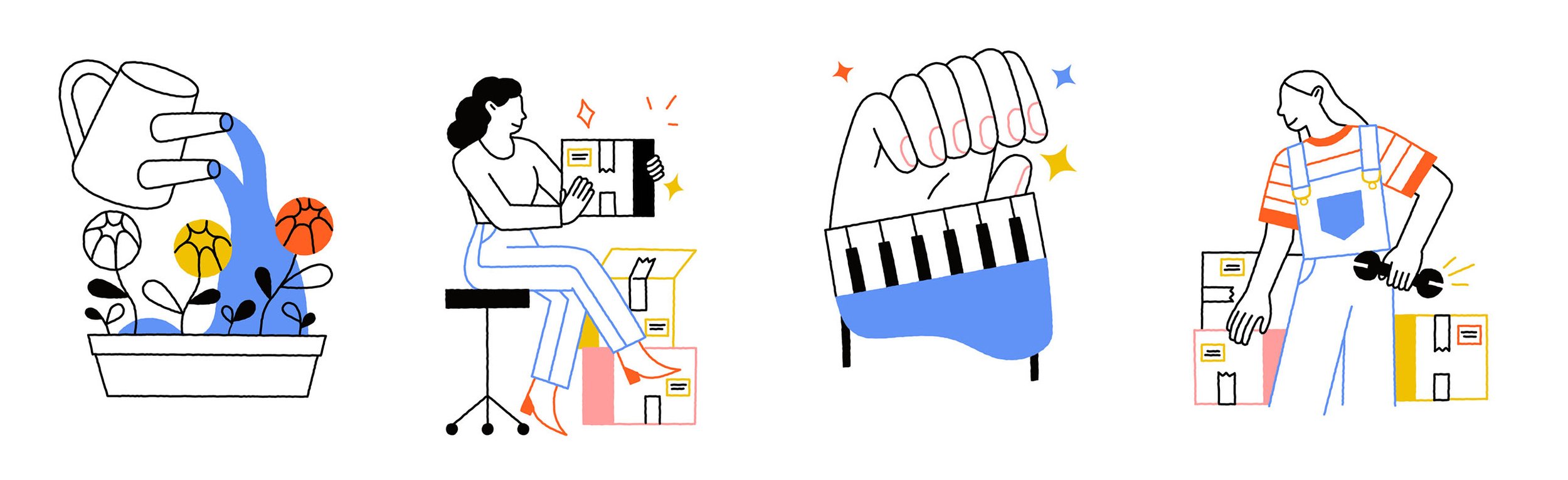
Spot illustrations use case sample

Spot illustrations night mode samples

The Marketing team also wanted to have an option to ‘bedazzle’ a dreary banner or marketing flyer. With some fun lines and shapes that could easily be done and having
a small library of those on hand made it that much easier!

Spot illustrations use case sample

Spot illustrations samples from Illustration library