

Client
Services
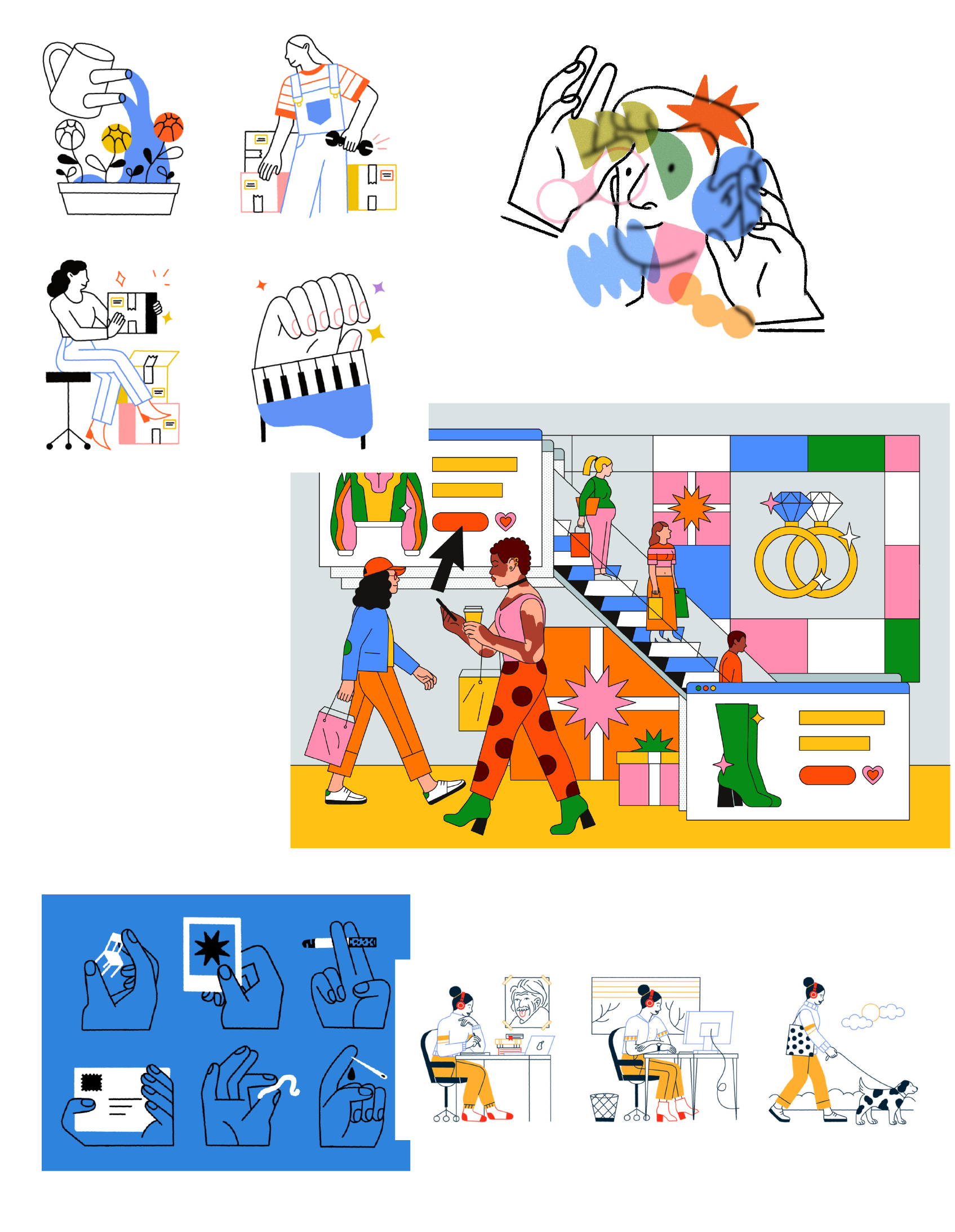
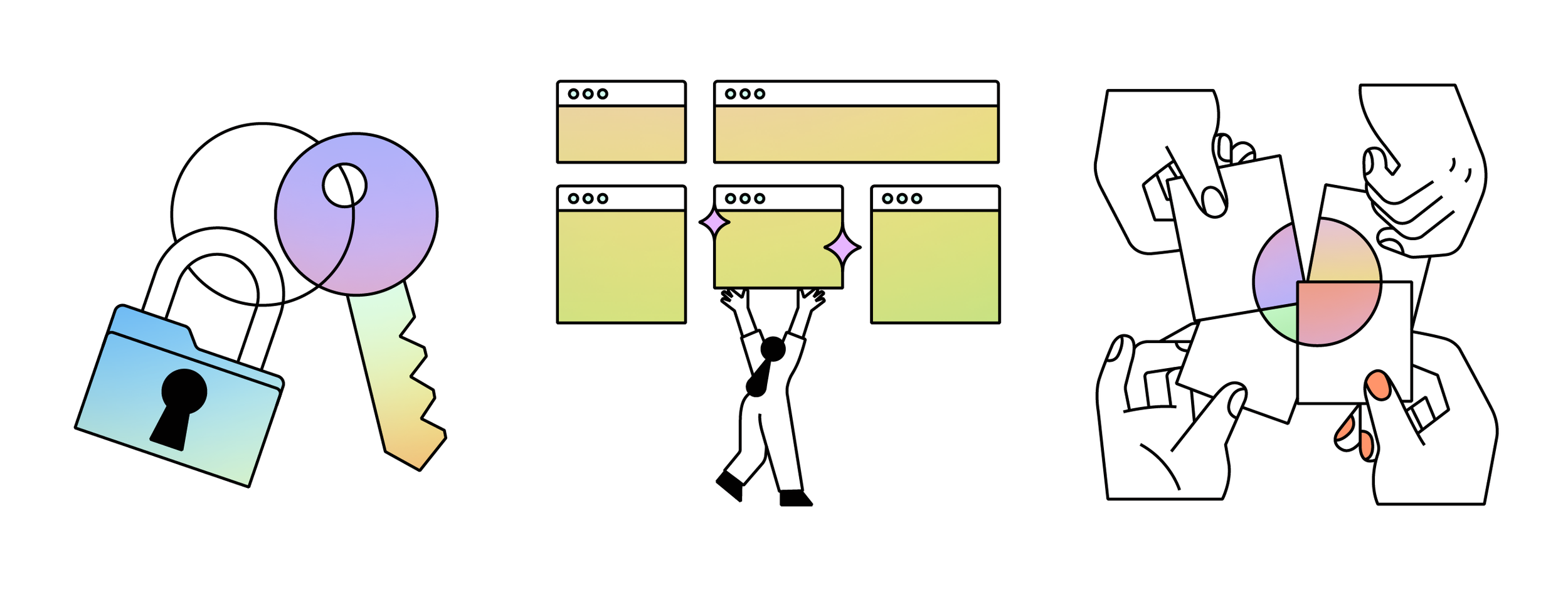
Illustration & Iconography
Art Direction
Industry
Tech & Software
ShareFile is a secure content collaboration, file sharing and sync software that supports all the document-centric tasks and workflow needs of small and large businesses.
The company also offers cloud-based or on-premises storage, virtual data rooms and client portals.
I teamed up with the very talented peeps at Athletics to create an illustration style that fit ShareFile’s new re-brand expression.
Their brand is modernising to reflect the energetic, human, thoughtful, invested company that they are, as well as to tell the story of their brand promise, everyday magic. ✨
Project Insights
As ShareFile launched their new identity to market, they needed a hardworking starter library of illustrations that could support communications in key touchpoints.
”Illustration should help bring humanity to the brand, telling stories of the clients’ challenges and the solutions, as well as offer a vision of their promise, Everyday Magic. Bringing personality, warmth and cleverness to their communications.”
Examples of previous work the client gave as reference.
Main key touch points were
Help tell complex stories around the clients challenges.
Brings a bit of personality, warmth and cleverness to their communications.
More differentiated approach to storytelling than photography, while providing more flexibility.
Help stand out amongst competitors
Sketching and planning faze
With the references and insights in hand, I started sketching away our concepts for a few of the scenarios that we could then use to play around with the style exploration.
I usually pick 2-3 spots and/or icons to start with and then once we decide on style we can continue with the rest. In the sketching faze we focus on tone and voice.

Sketches sample
Style exploration
Here is where the fun begins. I almost always end up doing around two style directions but this one ended up being three because we were working with a few colors and we wanted the distribution to feel light and not overpower the illustrations.
On the right you can see the first tow directions we went with. In one I tried adding this dot texture and we used the colors amply.
Second option was using gradients and blacks as accents for a little more depth.

In the end we settled on a black and white version white also using tints of one color throughout individual illustrations. This was they could be used on a colourful background or just white.
It gave the client more than one way to showcase them so hence more variety.


